Maps With Ggplot
This is the code to build maps for morocco 12 states.
The geojson file is located here : geojson file link
library(geojsonio)
spdf <- geojson_read("C:/Users/John Doe/Desktop/Covid/ma-convid19-state.geojson",  what = "sp")


# 'fortify' the data to get a dataframe format required by ggplot2
library(broom)
spdf_fortified <- tidy(spdf)
# Add column "region" and bind it to "names.FR" from first file
spdf_fortified$region <- factor(as.numeric(spdf_fortified$id))
levels(spdf_fortified$region) <- spdf$Name.FR
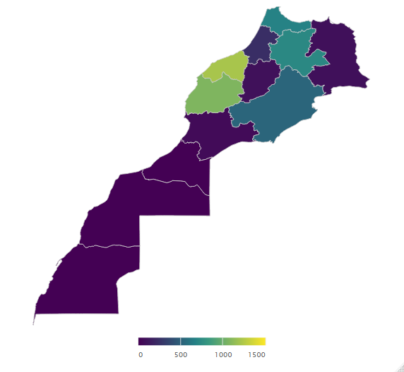
# Build your informative dataset which contains the information you ant to plot
reg_cases <- data.frame(spdf@data[["Name.FR"]], spdf@data[["Active.cases"]])
names(reg_cases) <- c("region", "active")
#Merge datasets into one full dataset
active_regions <- merge(spdf_fortified, reg_cases)
# Plot it
library(ggplot2)
library(ggthemes)

# Old plot
# ggplot() +
#   geom_polygon(data = spdf_fortified, aes( x = long, y = lat, group = group), fill="#69b3a2", color="black") +
#   theme_void() +
#   coord_map()

ggplotly(ggplot() +
  geom_polygon(data = active_regions, aes( x = long, y = lat, group = group, fill = active)) +
  coord_map() +
  theme_map())

# At the outset this looks fine, but if you count the states,
# you'll see you only have 14! The reason is that Berlin
# and Bremen are city-states located within the shape definitions of other states.
# You can solve this by reording the data (like you did before),
# or by adding two specific layers,
# for example,
#
# geom_polygon(data = subset(bundes_unemp, id == "Berlin"))
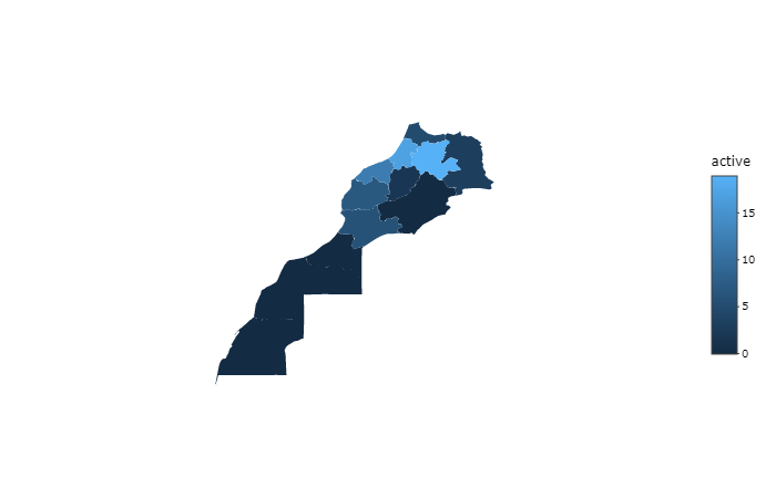
Or using highchart

library("highcharter")

library("geojsonio")

library("httr")


######################################################################################################

maroc <- "https://raw.githubusercontent.com/chichak/Covid19-MA/master/ma-convid19-state.geojson" %>%
  GET() %>%
  content() %>%
  jsonlite::fromJSON(simplifyVector = FALSE)

maroc$features[[1]]$properties

dfmaroc <-  maroc$features %>%
  map_df(function(x){
    as_data_frame(x$properties)
  })


names(dfmaroc) <- c("ID", "arname", "frname", "totalcas", "active", "deaths", "recovered", "fill", "opacity")
dfmaroc

highchart(type = "map") %>%
    hc_add_series_map(map = maroc, df = dfmaroc, joinBy = "ID", value = "active")%>%
  # hc_colorAxis(stops = color_stops(n = 12, colors = c("#008a39","#fabf37", "#ffe675","#fad739", "#ffb459" , "#fd2549")))%>%
   hc_colorAxis(stops = color_stops()) %>%
   hc_tooltip(useHTML = TRUE, headerFormat = "",
              pointFormat = "Le nombre des cas actifs à {point.frname} est: {point.active}")
  # hc_add_series(mapData = maroc, showInLegend = FALSE) %>%
  #hc_add_series(data = dfmaroc, type = "mappoint",
                                #name = "Airports", tooltip = list(pointFormat = "{point.active}"))

######################################################################################################